Data Visualization in Machine Learning
In this post, I have tried to give a brief on data visualization which is a part of exploratory data analysis.
Data visualization is a part of exploratory data analysis. We have understood the concept of exploratory data analysis in the last post. It is an initial investigation of the provided data with the help of graphs, charts, or other tools and makes some conclusions and predictions on the data. So, it is fine, we will make a conclusion or predictions but for that, we have to make charts, graphs, or other visualizations, and it is called data visualization. So, we can conclude data visualization as:
Data visualization is nothing but takes the data provided and convert it into graphs, charts, or any other visual look to predict the data and make some conclusions.
Why we need data visualization?
Let’s take an example to understand the use of data visualization in detail. Suppose we have a data of house price based on some features such as the number of beds, area, building year, etc. Suppose we want to know the highest pricing house in the provided data, or second-highest, or lowest, etc. Of course, we can achieve it by using programming. But we can easily do it by doing data visualization. If we plot the data in the graph, we can come up with all details in one shot. There is no need to do separate work to find the answers to the above questions. But if we want to implement it using a programming language then we require to do a separate code to find the above achievements. So data visualization makes things simple, easy to understand, interactive, and more readable. This is why we need data visualization.
Methods to make data visualization
There are many methods to make a data visualization. We will cover some top methods to visualize the data.
1) Line Graph:
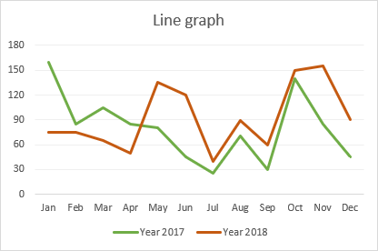
If we have linear or discrete data then we can go ahead with a line graph. It is one of the popular standard graphs widely used in data visualization. Generally, the line chart is used in showing trends, change made over time, data over years, etc. Generally, we put the data on the y-axis and the time, or year on the x-axis.
This is what the line graph looks like. We will implement it using different tools in the next post.
2) Bar Graph:
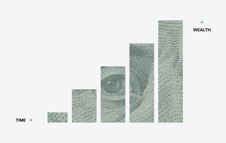
It is also a widely used graph and even we have created it in 10th and 12th standard. We fit the data on the x-axis and y-axis in the same fashion as the line graph. The difference between the line graph and bar graph is line graph join the points using line and bar graph plot a bar up to that point.
This is what the general bar graph looks like. There are some more types in the bar graph which are as follows.
We can see the difference in these graphs clearly. In a separated graph, we will make a separate bar for each entry, even the same entry for two different categories. In, Interleaved graph, we will cluster categories at the same place, as we can see in the above graph. In the stacked graph, we will grow the bar with another color for other categories.
3) Column Chart:
The column chart is a bar graph with a horizontal direction. Only this is a difference other is same in a bar graph and column chart.
A column chart is nothing but the horizontal view of the bar graph.
4) Pie Chart:
The pie chart is a circle, which shows the count of data with respect to 360 degrees. I mean we convert the count of data with respect to 360. it is the same concept as a percentile.
We can show the different colors for each category in the data. We can see the percentage of data in each category in the above graph. it means all data is distributed in 100%.
5) Scatter Plot:
The Scatter plot shows all data points in the pointed format in the graph. We will plot one point on a graph for each record. After plotting all points on the graph we can analyze it and make some conclusions.
There are many other types of graphs and charts but these are some mostly used graphs. There are some more we can use like bubble chart, mekko chart, etc.
Tools to develop graphs
We can make the above graphs of data using some tools and libraries. We can use python libraries to implement it.
1) Mathplotlib:
It is a plotting library for the Python programming language. There are many functions to implement all types of graphs. We will use it for making the above graphs from the next post.
2) Seaborn:
It is also a data visualization library used in the python programming language. We will implement graphs using this library also.
3) Plotly:
Another library for the same purpose. It is a widely used library for data visualization.
4) Tableau:
A tableau is software where we can feed the data and arrange attributes in a proper format and make a visualization. It doesn’t need any programming language and hence it is a widely used tool for data visualization. There are many options in the software such as we can make a dynamic visualization and post it in the account and share it with anyone. We will use it from the next post to make data visualization.
There are many libraries and tools there and we can use them. But these are I used till now and these are at the top in use by the experts. Of course, we can go ahead and learn other tools and libraries.
Conclusion:
In this particular post I have tried to give a brief on data visualization, what is data visualization, why we `need it, etc. Also, we have discussed different types of visualizations with examples. At the last, we have seen libraries and tools to implement the data visualization.
Thank you.


